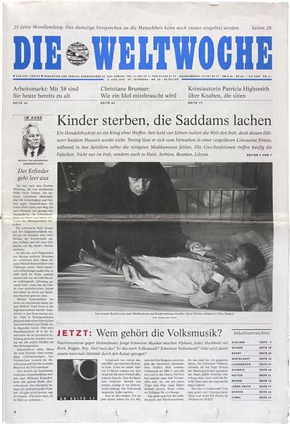
Like the NZZ since 2010: an interesting photograph on the front page as a pull-out for a story inside.
Like the NZZ since 2010: an interesting photograph on the front page as a pull-out for a story inside.
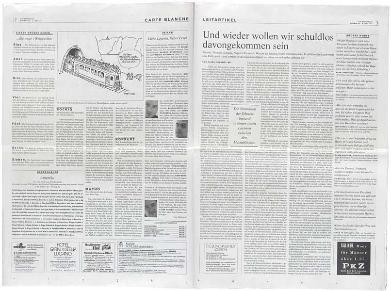
The lead article is banned to page three.
The lead article is banned to page three.
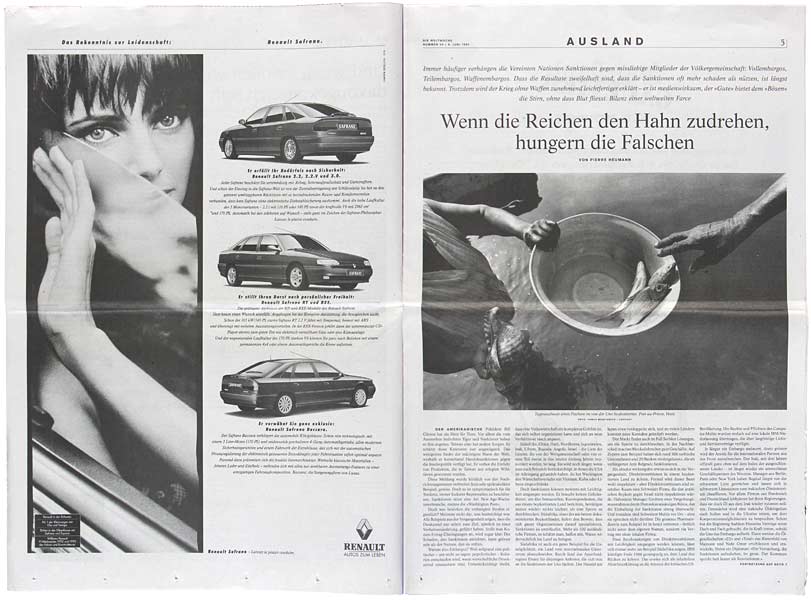
generous, well-selected photography
generous, well-selected photography
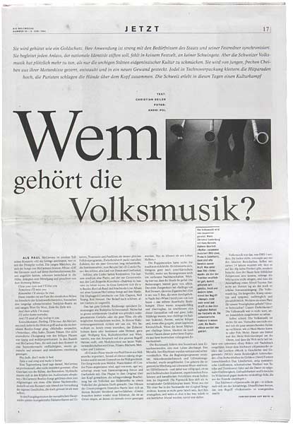
Opening page for a three-page focus
Opening page for a three-page focus
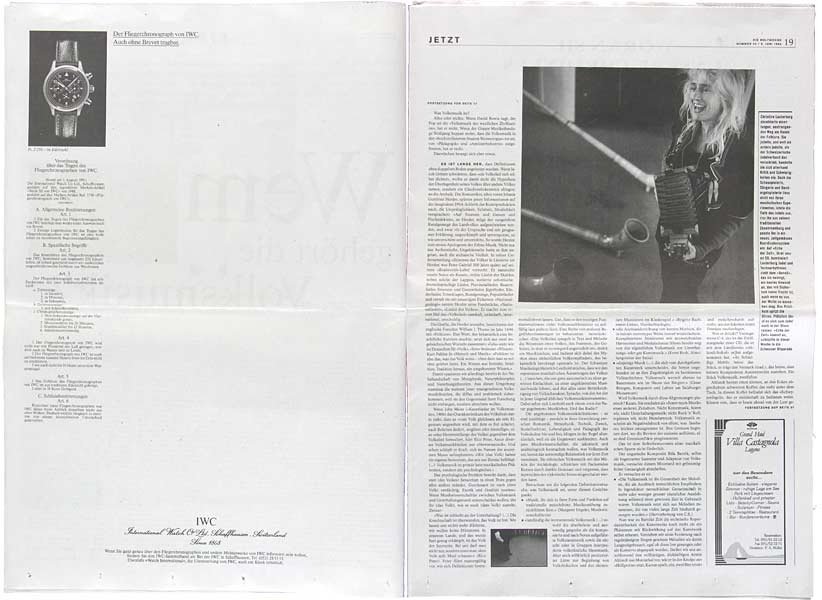
Photographs by Andri Pol
Photographs by Andri Pol
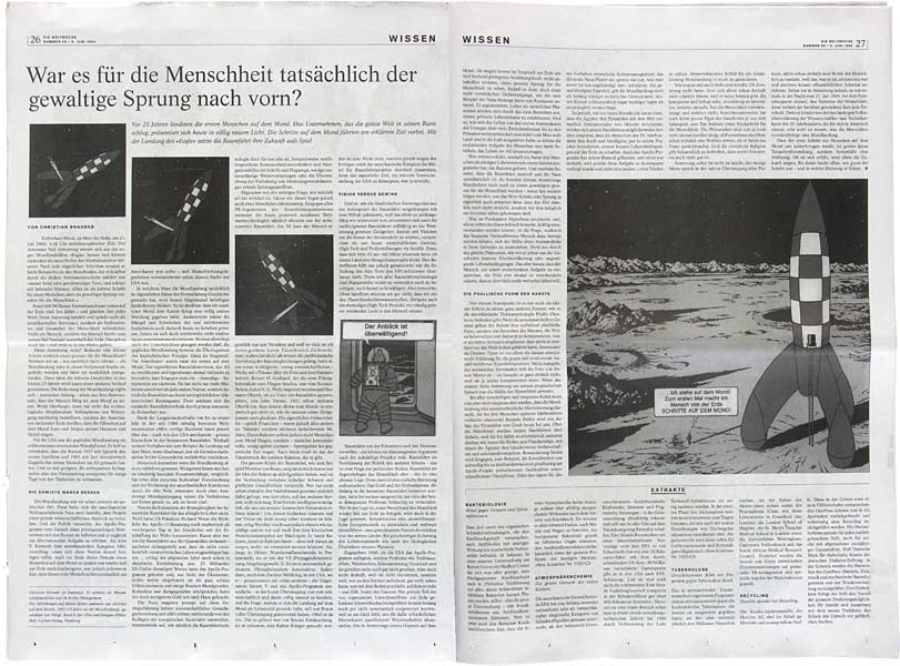
Not only photography: also illustrations
Not only photography: also illustrations
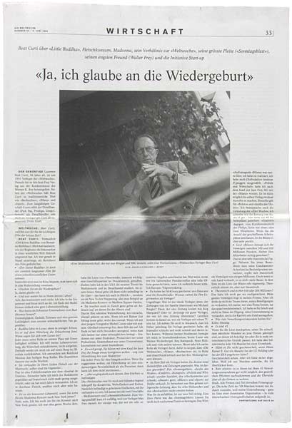
The publisher and his visions
The publisher and his visions
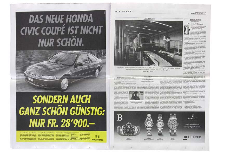
Photographic headers: THE WORKPLACE
Photographic headers: THE WORKPLACE
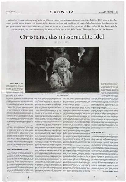
Fine typography with well-controlled black and white photography
Fine typography with well-controlled black and white photography
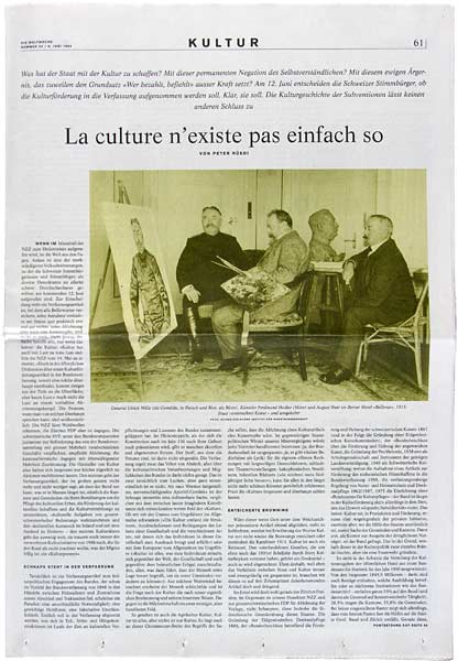
Historical photographs as attention-getter
Historical photographs as attention-getter
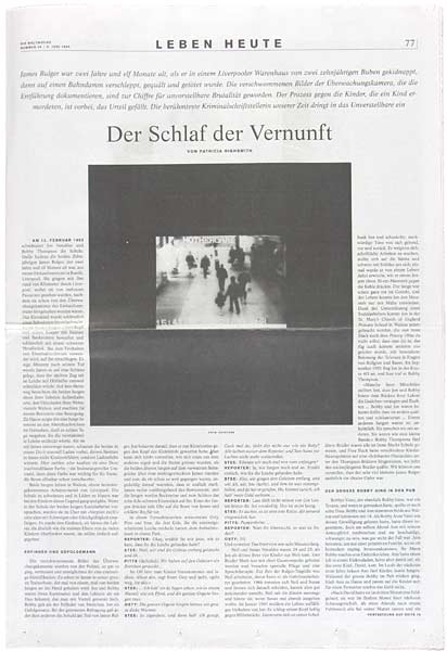
visual documents of time
visual documents of time
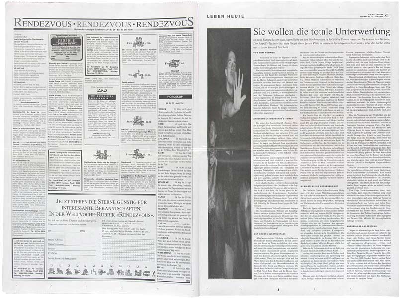
bold, unusual image formats
bold, unusual image formats
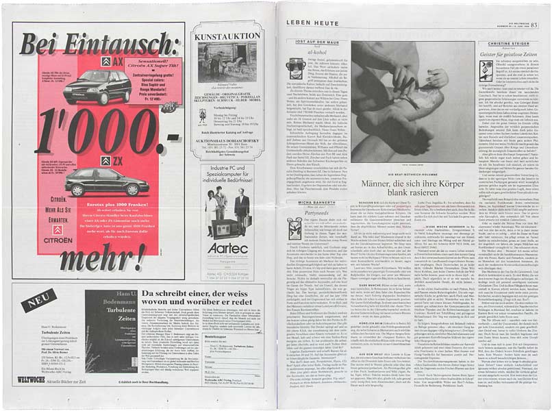
Columns with fixed authorship. Yvonne Griss photographs week after week.
Columns with fixed authorship. Yvonne Griss photographs week after week.
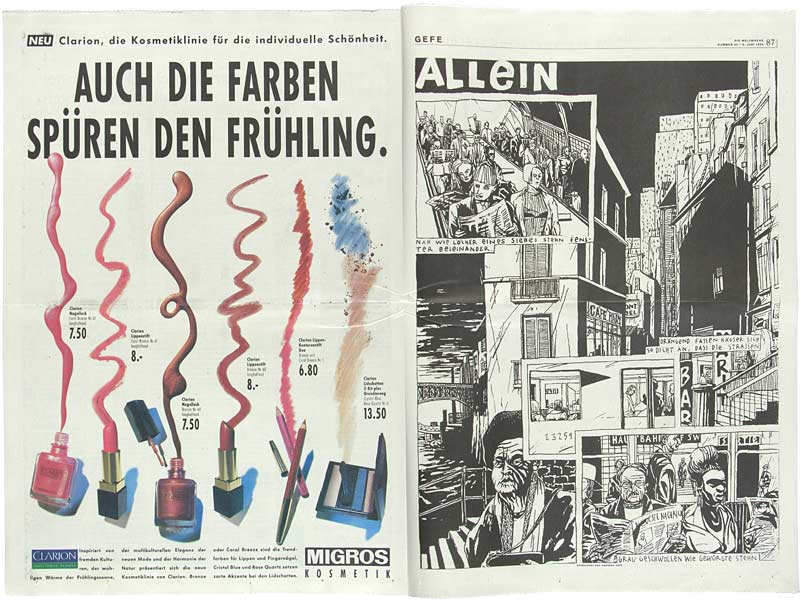
Lucerne tradition: COMIX
Lucerne tradition: COMIX
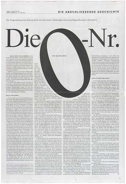
Project manager Walter Bosch on ZERO.
EDITING Jost auf der Mauer, Christian Seiler, Markus Schneider, DESIGN Atelier EST, Lucerne
Project manager Walter Bosch on ZERO.
EDITING Jost auf der Mauer, Christian Seiler, Markus Schneider, DESIGN Atelier EST, Lucerne